DM Flowchart Designer
DM Flowchart Designer — User Guide
DM Flowchart Designer — User Guide
Everything in DM Flowchart Designer, explained — the same guide that's built into the app, for Mac and iPad. On the Mac you'll find it under Help → User Guide; on iPad it's under Menu → User Guide.
Download on the App Store · Download the manual (PDF) · About DM Flowchart Designer
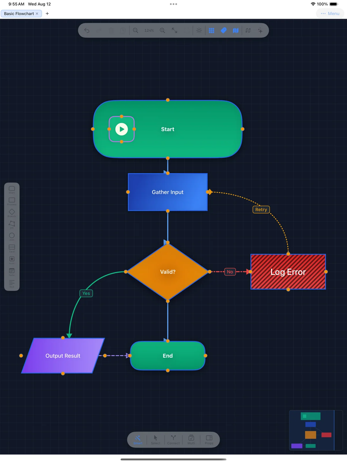
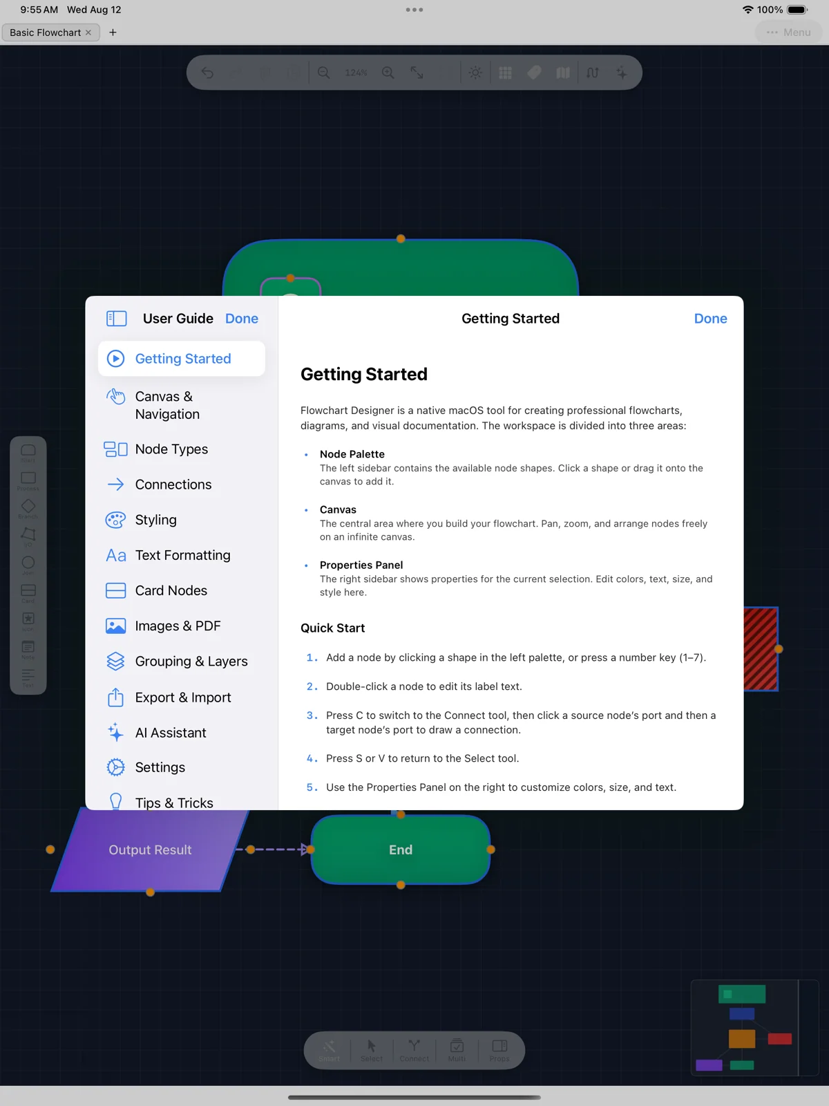
This guide is built into the app — shown here on iPad (Menu → User Guide).
Getting Started
Flowchart Designer is a native macOS tool for creating professional flowcharts, diagrams, and visual documentation. The workspace is divided into three areas:
- Node Palette — The left sidebar contains the available node shapes. Click a shape or drag it onto the canvas to add it.
- Canvas — The central area where you build your flowchart. Pan, zoom, and arrange nodes freely on an infinite canvas.
- Properties Panel — The right sidebar shows properties for the current selection. Edit colors, text, size, and style here.
Quick Start
- Add a node by clicking a shape in the left palette, or press a number key (1–7).
- Double-click a node to edit its label text.
- Press
Cto switch to the Connect tool, then click a source node's port and then a target node's port to draw a connection. - Press
SorVto return to the Select tool. - Use the Properties Panel on the right to customize colors, size, and text.
- Save your work with
⌘Sor export as PNG, PDF, or SVG.
Tools
Select (S / V)— Click to select nodes and connections. Drag to move. Shift-click for multi-select. Drag on empty canvas to marquee-select.Connect (C)— Click a source port, then click a target port to draw a connection arrow between two nodes.Pan (H)— Click and drag to pan the canvas. You can also hold Space temporarily in any tool to pan.
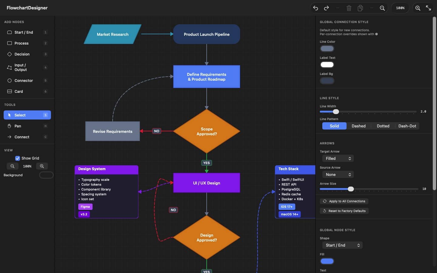
The workspace on Mac: node palette (left), infinite canvas (center), properties panel (right).
Canvas & Navigation
The canvas is an infinite workspace. Use these controls to navigate:
Zooming
⌘ +/⌘ –— Zoom in and out from the menu or keyboard.- Pinch gesture — Pinch on a trackpad to zoom centered on the gesture.
⌘+ Scroll wheel — Scroll while holding Command to zoom at the cursor position.- Zoom controls — Use the +/– buttons and percentage display in the toolbar.
⌘ 0— Reset to actual size (100% zoom, centered).⌘ ⇧ 0orF— Fit all nodes into the visible viewport.
Panning
- Two-finger scroll — Scroll on a trackpad to pan the canvas.
Hkey — Switch to the Pan tool and drag to pan.- Space (hold) — Hold Space in any tool to temporarily pan; release to return to your previous tool.
- Middle mouse drag — Click and drag with the middle mouse button to pan.
Selection
- Click — Click a node or connection to select it.
- Shift + Click — Add or remove a node from the current selection.
- Marquee — Click and drag on an empty area to draw a selection rectangle.
⌘ A— Select all nodes on the canvas.- Escape — Deselect all and cancel any pending operation.
Grid
A dot grid is shown by default to help with alignment. Toggle it from the toolbar or in Settings → General. The canvas background color can also be customized.
Minimap
A minimap overlay appears in the bottom-right corner of the canvas, showing a bird's-eye view of your entire flowchart. The blue rectangle indicates the currently visible viewport.
M— Press M to toggle the minimap on or off.- Toolbar — Click the map icon in the toolbar to toggle the minimap.
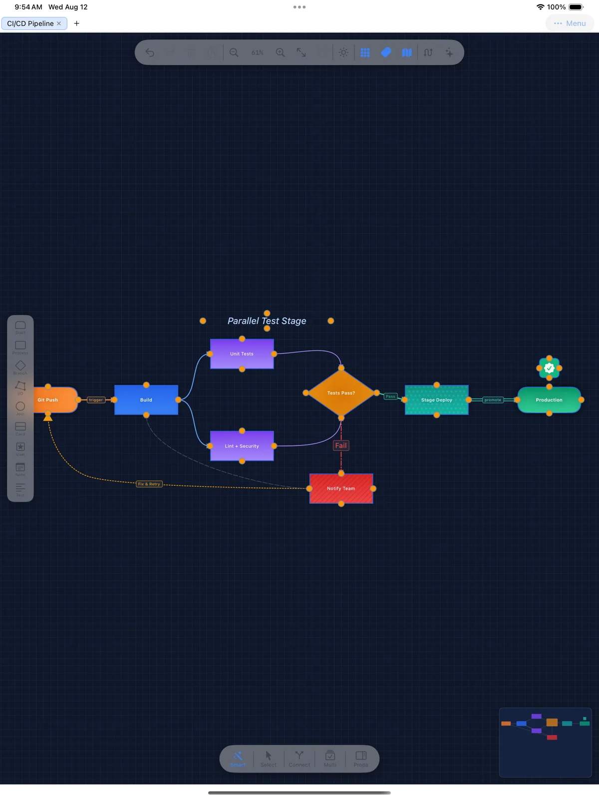
Navigating a larger flowchart on iPad — the minimap (bottom right) shows the visible viewport.
Node Types
Flowchart Designer includes seven node shapes, each suited to a different purpose in standard flowchart notation:
Start / End (1)— A rounded rectangle used to mark the beginning or end of a process flow.Process (2)— A standard rectangle representing an action or operation step.Decision (3)— A diamond shape for branching logic—typically Yes/No or True/False decisions.Input / Output (4)— A parallelogram indicating data input or output operations.Connector (5)— A small circle used as a junction point to simplify complex flows or connect across pages.Card (6)— A rich content card with a header, body text, and optional badges. See the Card Nodes section for details.Image (7)— An imported image or PDF. Press 7 or use File → Import Image (⌘I). See the Images & PDF section.
Adding Nodes
There are several ways to add nodes to the canvas:
- Palette click — Click a shape in the left sidebar to place it at the center of the canvas.
- Number keys — Press 1–7 to instantly add the corresponding shape.
- Import — Use
⌘Ito import an image or PDF file as a node.
Editing Nodes
- Move — Click and drag a selected node to reposition it.
- Resize — Drag any of the 8 resize handles around a selected node. For images, hold Shift or enable Lock Aspect Ratio to constrain proportions.
- Edit text — Double-click a node to edit its label text inline on the canvas.
- Properties — Select a node and use the right panel to change colors, fill style, text properties, and dimensions.
- Duplicate — Press
⌘Dor click Duplicate in the Properties Panel. - Delete — Press Delete or click the Delete button in the Properties Panel.
- Copy / Paste — Use
⌘Cand⌘Vto copy and paste nodes (pasted at a slight offset).
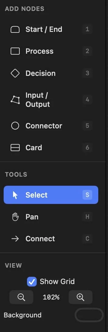
The node palette: each shape has a number-key shortcut (1–7).
Connections
Connections are directed lines (arrows) linking two nodes. They represent flow, data movement, or relationships.
Drawing Connections
- Press
Cto switch to the Connect tool. - Click a port (small circle) on the source node—top, bottom, left, or right.
- Click a port on the target node to complete the connection.
- Press Escape to cancel a pending connection.
For image nodes, you can click anywhere on the node surface to create a connection from that exact point, rather than snapping to a fixed port.
Labels
Select a connection and type a label in the Properties Panel. Use the Position slider to move the label along the line—0 is at the source, 0.5 is the midpoint, and 1 is at the target.
Waypoints
- Add — Double-click on a connection line to insert a waypoint. The line will bend through this point.
- Move — Drag a waypoint to reposition it.
- Delete — Select a waypoint and press Delete, or use "Clear All" in the Properties Panel.
Direction & Style
- Flip — Click "⇄ Flip" in the Properties Panel to reverse the connection direction.
- Bidirectional — Click "⇆ Bidirectional" to add arrows on both ends.
- Ports — Change source or target ports using the segmented picker in the Properties Panel.
Arrow Styles
Five arrow head styles are available for both the source and target ends:
- None — No arrowhead—a plain line end.
- Standard — An open V-shaped arrowhead (the default for the target end).
- Filled — A solid filled triangle arrowhead.
- Open — An outlined triangle arrowhead.
- Diamond — A filled diamond shape.
Line Patterns
Connection lines can be drawn in four patterns: Solid, Dashed, Dotted, or Dash-Dot. When using a non-solid pattern, adjust the Gap Spacing to control the distance between dashes or dots.
Auto-routing
Flowchart Designer can automatically route connections around nodes that overlap the direct path. This inserts waypoints so connections flow cleanly without crossing through other nodes.
- Single connection — Right-click a connection and choose "Auto-route" from the context menu.
- All connections — Click the auto-route button in the toolbar (arrow.triangle.swap icon) or use Edit → Re-route Connections to route every connection at once.
Auto-routing works by detecting which nodes lie in the direct path between the source and target, then adding two waypoints to detour around them. You can manually adjust the waypoints afterward if needed.
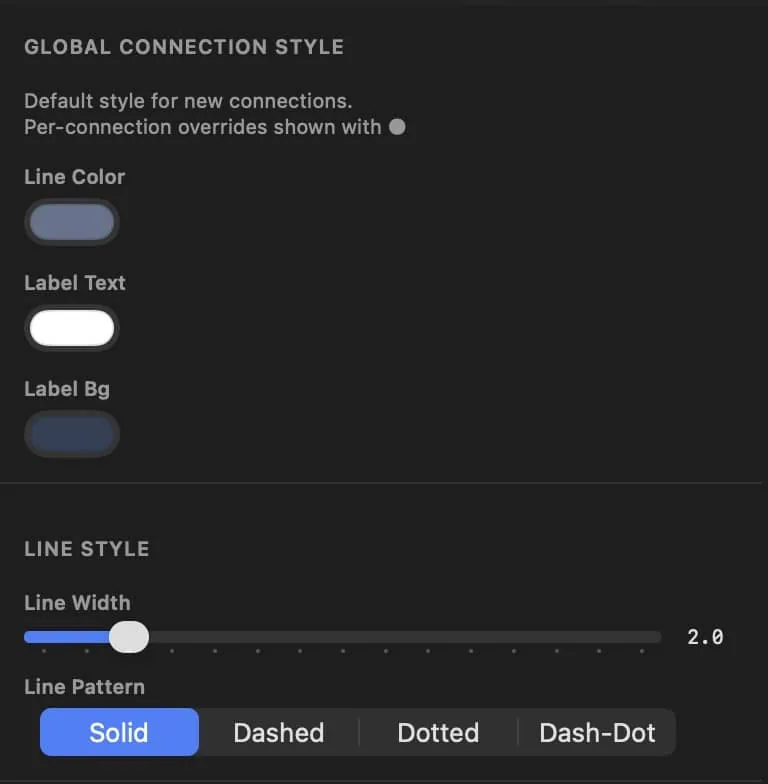
Connection styling: line color, labels, width, and pattern.
Styling
Flowchart Designer uses a cascading style system. Global styles set the defaults for all nodes and connections. You can then apply per-node or per-connection overrides without affecting other elements.
Global vs. Per-Element Styles
When nothing is selected, the Properties Panel shows the Global Connection Style and Global Node Style editors. Changes here set the default appearance for all new elements and any existing ones that haven't been individually customized.
When you change a color or style on a selected node or connection, it becomes a per-element override. Overridden properties show an orange dot (●) next to their label. Click the reset arrow (↩) to remove the override and revert to the global default.
Node Styling
- Fill Color — The background color of the node.
- Text Color — The color of the node's label text.
- Border Color — The color of the node's outline.
- Quick Colors — Click a color swatch for fast fill color changes. Use Custom for the full color picker.
- Reset All to Global — Remove all overrides on a node at once, reverting to global defaults.
Fill Styles
Nodes support three fill types:
- Solid — A single flat color (the default).
- Linear Gradient — A two-color gradient with an adjustable angle.
- Radial Gradient — A two-color gradient radiating from the center outward.
Additionally, you can add a pattern overlay on top of any fill type:
- Stripes — Diagonal lines across the node.
- Dots — A repeating dot pattern.
- Grid — A grid of horizontal and vertical lines.
- Crosshatch — Diagonal lines in both directions.
Patterns have adjustable color, spacing, line width, and opacity.
Connection Styling
- Line Color — The color of the connection line and arrowheads.
- Line Width — Thickness of the line (1–8 points).
- Line Pattern — Solid, Dashed, Dotted, or Dash-Dot.
- Arrow Size — The size of arrowheads (4–24 points).
- Label Colors — Customize the label text color and background color independently.
Typography
Flowchart Designer offers full text formatting controls including font family, size, weight, italic, underline, alignment, and letter spacing. These can be set per-node or as global defaults. See the Text Formatting section for complete details.
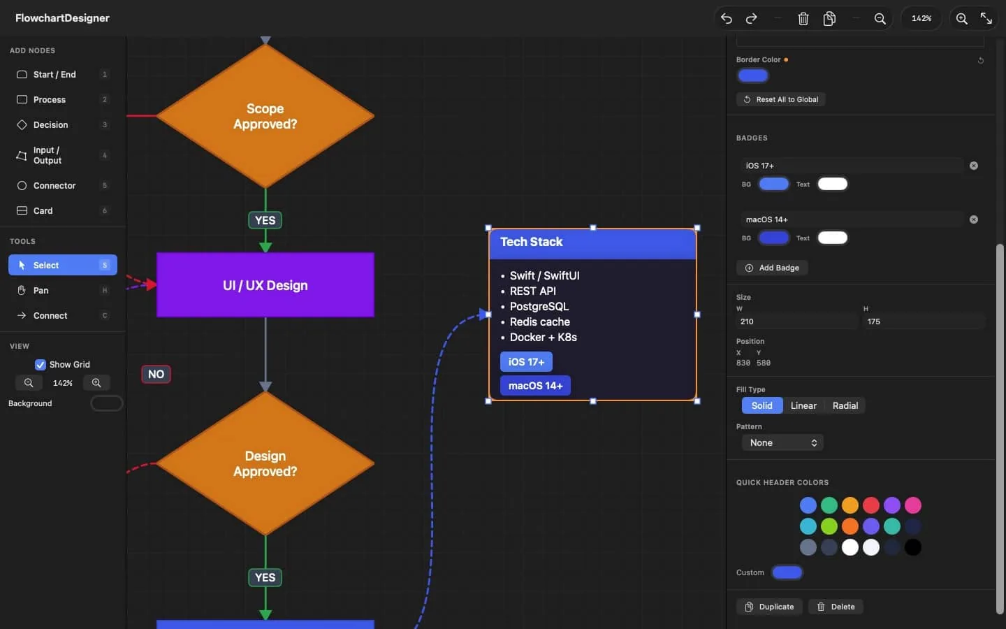
Per-node styling in the properties panel: fill, border, and quick colors.
Text Formatting
Every node supports detailed text formatting controls. You can customize the font family, size, weight, style, alignment, and letter spacing on a per-node basis, or set global defaults that apply to all nodes of a given shape.
Per-Node Overrides
Select a node and look for the Text Formatting section in the Properties Panel (below the color controls). Each property can be overridden independently. Overridden properties show an orange dot (●) next to their label, and you can click the reset arrow (↩) to revert to the global default.
Font Family
Choose from the system font (the default) or any font installed on your Mac. The font picker lists all available font families alphabetically. Selecting "System" reverts to the standard macOS system font.
Font Size & Weight
- Size — Adjust from 6 to 48 points using the slider or by typing an exact value.
- Weight — Choose from Light, Regular, Medium, Semibold, or Bold.
Style Toggles
- Italic (I) — Toggle italic rendering. The button highlights when active.
- Underline (U) — Toggle an underline beneath the text. The button highlights when active.
Text Alignment
Choose Left, Center, or Right alignment using the segmented picker. This controls how the text is positioned within the node's bounds.
Letter Spacing
Adjust the spacing between characters from –2 to 10 points. A value of 0 uses normal spacing. Positive values spread characters apart; negative values tighten them.
Card Nodes
Card nodes have two independent sets of text formatting controls:
- Heading text — Font, size, weight, style, alignment, and spacing for the card's header title.
- Body text — A separate set of the same controls for the card's body content, plus a Line Spacing slider to adjust the distance between lines of body text.
Global Text Defaults
When nothing is selected, the Properties Panel shows the Global Node Style editor. Under each shape's settings, you'll find Text Defaults with the same font controls. Changes here set the default text formatting for all new nodes of that shape and any existing nodes that haven't been individually customized. Card shapes also show a Body Text Defaults section.
Export Support
All text formatting is preserved when exporting. SVG exports include font-family, font-weight, font-style, text-decoration, and letter-spacing attributes. PDF and PNG exports render text using the exact fonts installed on your system.
Card Nodes
Card nodes are rich-content containers ideal for detailed information, documentation blocks, or data summaries. They feature a colored header, scrollable body text, and optional badges.
Structure
- Header — A colored banner at the top displaying the card's title. Edit the heading text and header colors in the Properties Panel.
- Body — A multi-line text area below the header. Supports bullet points (•) and bold text (**text**).
- Badges — Small colored tags at the bottom of the card. Use them for status indicators, categories, or callouts.
Editing Body Text
The body text editor in the Properties Panel includes a formatting toolbar with Bold (B) and Bullet (•) buttons. Drag the resize handle below the editor to make it taller or shorter.
Formatting uses a simple text convention:
- Bold — Wrap text in double asterisks: **bold text**
- Bullets — Start a line with • (the bullet character, inserted by the toolbar button).
Badges
Add badges by clicking "Add Badge" in the Properties Panel. Each badge has:
- Text — The badge label (e.g., "In Progress", "v2.0").
- Background Color — The badge's fill color.
- Text Color — The badge's label color.
Click the ✕ button next to a badge to remove it. Badges are displayed as rounded pills at the bottom of the card.
Card Colors
- Header Color — The background color of the header banner.
- Header Text Color — The heading text color.
- Body Color — The background color of the body area (uses Fill Color).
- Body Text Color — The color of the body text (uses Text Color).
- Border Color — The card's outer border color.
Images & PDF
Import external images and PDF files as nodes on your canvas. Image nodes participate in connections and can be styled like any other node.
Importing Images
Use File → Import Image (⌘I) or press 7 to open the file picker. Supported formats:
- Raster images — PNG, JPEG, GIF, TIFF
- Vector documents — PDF (first page is imported)
PDF Import
When you import a PDF file, Flowchart Designer stores both a high-resolution rasterized preview (for fast canvas display) and the original PDF data. This gives you the best of both worlds:
- Canvas display — A crisp 2× DPI rasterized image for smooth interaction.
- PDF export — When you export your flowchart as PDF, imported PDF nodes are rendered as true vector graphics—no quality loss at any zoom level.
- PNG / SVG export — Uses the high-resolution rasterized image.
Aspect Ratio
Image nodes default to a locked aspect ratio. When resizing:
- Shift + drag — Hold Shift while dragging a resize handle to constrain the aspect ratio (works on all nodes).
- Lock toggle — For image nodes, a "Lock Aspect Ratio" checkbox appears in the Properties Panel. When enabled, all resize operations maintain the original proportions.
Connections on Images
Unlike standard nodes with four fixed ports, image nodes support click-anywhere connections. In the Connect tool, click any point on the image surface and the connection will originate from or terminate at that exact position. The connection's curve direction is automatically determined based on the nearest edge.
Grouping & Layers
Grouping Nodes
Select multiple nodes and press ⌘G to group them. Grouped nodes move together as a unit when you drag any member of the group. Press ⌘⇧G to ungroup.
To select multiple nodes: Shift-click individual nodes, drag a marquee selection on empty canvas, or press ⌘A to select all.
Multi-Select Operations
When multiple nodes are selected, the Properties Panel shows:
- Alignment tools — Align nodes by their left, center, right, top, middle, or bottom edges.
- Distribution — Distribute H and Distribute V evenly space three or more nodes.
- Quick Colors — Apply a fill color to all selected nodes at once.
- Duplicate / Delete — Operate on the entire selection.
Auto-layout (Tidy Up)
When your flowchart gets messy, use the Tidy Up feature to automatically arrange selected nodes in a clean tree layout based on their connections.
- Properties Panel — Select 2 or more nodes and click the "Tidy Up" button in the Layout section of the Properties Panel.
- Menu — Edit → Tidy Up Selection.
⌃⌘ T— Tidy Up Selection — Arrange selected nodes in a tree layout centered on the current selection.
The layout algorithm follows the direction of your connections to determine parent-child relationships, placing root nodes at the top and arranging children in layers below.
Z-Order (Layering)
Nodes are drawn in the order they were created. Use these commands to change the stacking order:
⌘ ]— Bring to Front — Move the selected node(s) to the top of the stack.⌘ [— Send to Back — Move the selected node(s) to the bottom of the stack.⌘ ⌥ ]— Bring Forward — Move up one layer.⌘ ⌥ [— Send Backward — Move down one layer.
Export & Import
Saving & Opening Projects
Flowchart Designer saves projects as JSON files. This format preserves all nodes, connections, styles, waypoints, and image data.
⌘ S— Save Project — Choose a location and save as a .json file.⌘ O— Open Project — Load a previously saved .json project file.
When you close the app with unsaved changes, you'll be prompted to save first.
Exporting Images
⌘ E— Export as PNG — A high-resolution raster image suitable for presentations and documents.⌘ ⇧ E— Export as PDF — A vector-quality document. Imported PDF images retain full vector fidelity.⌘ ⇧ S— Export as SVG — A scalable vector graphic for web use or further editing in vector editors.
All export formats render the full canvas content with a small margin around the bounding box of your nodes and connections. Custom text formatting (fonts, italic, underline, letter spacing) is fully preserved in all export formats.
Importing Images
⌘ I— Import Image — Bring in a PNG, JPEG, GIF, TIFF, or PDF file as an image node on the canvas.
Clear Canvas
File → Clear Canvas removes all nodes and connections, giving you a fresh starting point. This action can be undone with ⌘Z.
AI Assistant
Flowchart Designer includes an AI-powered assistant that can help you plan and generate flowcharts from natural language descriptions. Chat with the AI to refine your ideas, then generate a complete flowchart with one click.
Opening the AI Panel
There are several ways to open the AI Assistant:
- Toolbar — Click the sparkles (✨) icon in the toolbar.
- View menu — View → AI Assistant (
⌘). - File menu — File → Generate with AI… (
⌘⌥G).
The AI panel appears at the bottom of the workspace. Use the same controls to toggle it closed, or click the ✕ button in the panel header.
Setting Up API Keys
The AI Assistant uses a Bring Your Own Key (BYOK) model—you provide your own API key from the AI provider of your choice. Your keys are stored securely in the macOS Keychain and are never transmitted anywhere except to their respective provider.
To add an API key, open Settings (⌘,) and go to the AI tab. You'll see a section for each supported provider:
- Anthropic (Claude) — Get a key from console.anthropic.com. Provides Claude Sonnet and Claude Haiku models.
- OpenAI (GPT) — Get a key from platform.openai.com. Provides GPT-4o and GPT-4o Mini models.
- Google (Gemini) — Get a key from aistudio.google.com. Provides Gemini 2.5 Pro and Gemini 2.5 Flash models.
- xAI (Grok) — Get a key from console.x.ai. Provides Grok 3 and Grok 3 Mini models.
Each provider section includes a direct link to their API key console. Paste your key and click Save Key. You only need to set up the providers you want to use.
Chatting with the AI
The AI panel has a chat interface on the left where you can have a conversation before generating:
- Type a message describing what you want to create and press Return to send.
- The AI will respond with suggestions, clarifying questions, and recommendations for your flowchart.
- Continue the conversation to refine the scope, structure, and details.
- When you're satisfied with the plan, click Generate (
⌘↩).
The full conversation is used as context when generating, so the AI produces a flowchart that matches everything you discussed.
Generating a Flowchart
Click the Generate button on the right side of the panel. The AI will produce a complete flowchart with nodes, connections, colors, and layout based on your conversation or prompt.
- Single-shot — If you skip the chat and just type a prompt, click Generate to create a flowchart directly.
- With context — If you've been chatting, the entire conversation informs the generation.
- Regenerate — After a flowchart is created, click Regenerate to produce a new version. Add instructions in the text field to guide changes.
- New Chat — Click the reset (↺) button in the header to clear the conversation and start fresh.
Choosing a Provider & Model
The right side of the AI panel has Provider and Model pickers. Switch between providers at any time—only providers with a saved API key will be functional. Each provider offers two models: a more capable option and a faster/cheaper option.
Tips
- Be specific — The more detail you provide about your flowchart's structure, the better the result. Mention node types, branching logic, and edge cases.
- Iterate — Generate once, review the result, then chat about adjustments and regenerate.
- Try different models — If one model's output isn't quite right, try another provider or model for a different interpretation.
Settings
Open Settings with ⌘, (comma) or from the app menu. The Settings window has four tabs:
General
- GPU Rendering — Enable Metal-based compositing for potentially better performance on large documents.
- Show Grid — Toggle the dot grid background on the canvas.
- Canvas Background — Set the default background color for new documents.
Node Styles
Configure default appearance for each node shape. Select a shape from the segmented picker, then adjust:
- Colors — Fill, text, and border colors. Card nodes also have header and header text colors.
- Fill Style — Solid, linear gradient, or radial gradient. Plus optional pattern overlays.
- Text Defaults — Font family, size, weight, italic, underline, alignment, and letter spacing. Card nodes have separate heading and body text defaults.
Click "Reset [Shape] to Factory" to restore the original defaults for a specific shape.
Connections
Set default connection appearance: line color, label colors, line width, dash pattern, arrow styles, and arrow size. These defaults apply to all new connections and any existing ones without per-connection overrides.
Import / Export
- Export Settings — Save all your default styles to a JSON file for backup or sharing.
- Import Settings — Load styles from a previously exported settings file.
- Reset All — Restore every setting to its original factory value.
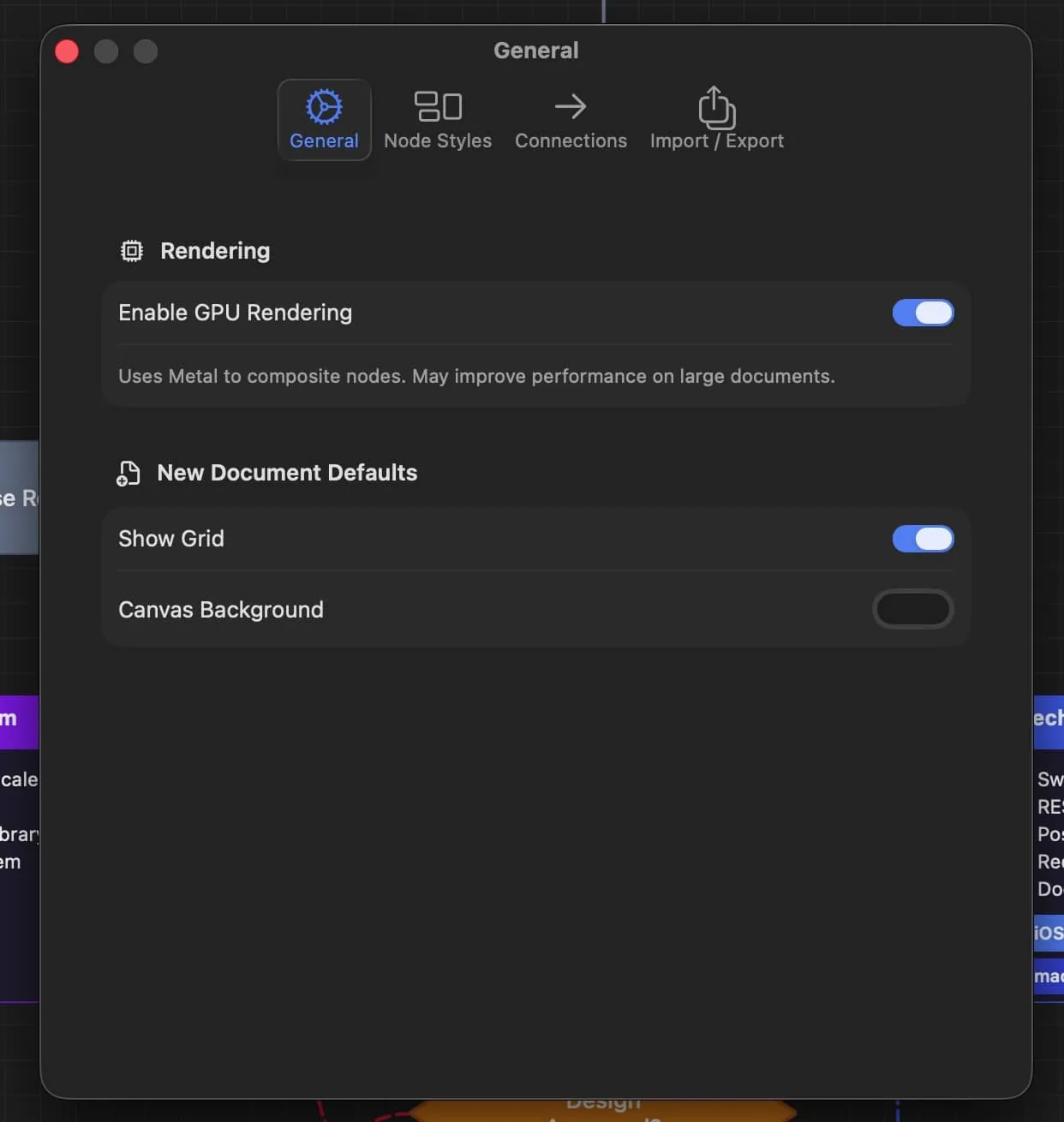
Settings → General: GPU rendering, grid, and canvas background.
Tips & Tricks
Workflow Tips
- Quick tool switching — Press
Sfor Select,Cfor Connect,Hfor Pan. Hold Space for a temporary pan from any tool. - Fast node creation — Use number keys 1–7 to add nodes without touching the palette.
- Inline editing — Double-click any node to edit its text directly on the canvas.
- Undo everything — Nearly every action supports Undo (
⌘Z) with up to 50 levels of history.
Alignment & Layout
- Precise alignment — Select 2+ nodes and use the alignment buttons in the Properties Panel to align edges or centers.
- Even distribution — Select 3+ nodes and use Distribute H or Distribute V to space them evenly.
- Size fields — Type exact pixel dimensions in the Size fields in the Properties Panel for precise control.
Connection Tips
- Route connections — Double-click a connection line to add waypoints. Drag waypoints to create clean routing around other nodes.
- Label positioning — Use the Position slider to place connection labels exactly where you want them along the line.
- Quick direction — Use the Flip and Bidirectional buttons in the Properties Panel for fast direction changes.
Style Efficiency
- Design globally first — Set up your global node and connection styles—including text formatting—before building your flowchart. All new elements will inherit these defaults.
- Override indicator — Look for the orange dot (●) next to property labels to see which properties have been customized on a specific element.
- Batch reset — Use "Apply to All" in the global style editor to strip all per-element overrides and enforce a uniform look.
- Settings portability — Export your style presets from Settings → Import/Export and share them with teammates or across machines.
Layout & Navigation
- Auto-layout — Select a group of connected nodes and press
⌃⌘T(Tidy Up) to automatically arrange them in a clean tree layout. - Auto-route — If connections cross through other nodes, use the auto-route toolbar button to automatically add waypoints that route around obstacles.
- Minimap — Press
Mto toggle the minimap—a bird's-eye overview of your entire flowchart that helps you navigate large diagrams. - Inline font matching — When you double-click a node to edit its text, the inline editor matches the node's font settings so you see exactly what the final text will look like.
Keyboard Shortcuts Reference
For a complete list of keyboard shortcuts, go to Help → Keyboard Shortcuts.
Still have a question? See the product page for a quick Q&A, or get in touch — a real person answers.